Half a year ago, it all started with NeverEndingBooks in which I set out a rather modest goal:
Why NeverEndingBooks? We all complain about exaggerated prices of mathematical books from
certain publishers, poor quality of editing and refereeing offered, as well as far too stringent book-contracts. Rather than lamenting about this, NeverEndingBooks gives itself one year to learn (and report) about the many aspects of the book-production cycle and to explore whether an alternative exists. If at the end of this year we will have produced at least one book this experiment will be considered a success. If,
however, we find out that it is an impossible task, we will explain where it all went wrong and why it is better to stick to an established PublishingHouse and accept its terms.
I assume we did manage to do it after all as you may check by visiting our storefront :
www.lulu.com/neverendingbooks. However, it all turned out to be quite different from what I had in mind half a year ago. So, perhaps it’s time to recap.
Originally, I’d planned to partner-up with the publisher-on-demand LightningSource but in the process they did require a VAT-number. In Belgium, the safest way to get one is to set up a non-profit organization (a VZW as we call
it). But then you have to write down your legal statutes, get them published in the Moniteur Belge (at a hefty price) but what really put me off was that you have to set up a “board of directors” consisting of at least three
people. I don’t mind following a folly but if I have to involve others I usually pass, so I abandoned the whole idea.
Still, I couldn’t help talking about the VAT-problem and at a certain time there was an idea to revive a sleeping VZW (=non-profit organization) of the Belgian Mathematical Society, the MaRC (MAthematical Research Centre), the statutes of which allowed to become a publishing house. But, this wouldn’t involve just two other people but the whole BMS so I decided
to forget all about it and have a short vacation in France together with a few (former)PhD-students.

Given plenty of sun, cheese and whine (not necessarily in that order) sooner or later we had to talk about _the_ problem. For Raf it was the first time he heard about it but when we realized I thought one could easily publish books well under 25 dollars he was immediately interested and insisted we should set up a board of directors and continue with the plan.
The different roles to play in the board were more or less self-evident : I had to be the treasurer (given the fact that I was the only with a secure, though small, income), Geert had to become chairman (being the only one possessing suits), Raf would be secretary (being the only one who could write better Flemish than English) and Jan or Stijn would do PR (as they are the only ones having enough social skills).
So, we went back willing to go through the whole process (at least 3 months) of obtaining a VAT-number.
But then Raf got so interested in the whole idea that he explored other possibilities (I think he was more motivated by the fact that his sister wanted to publish her thesis rather than anything else) and came up with lulu.com.
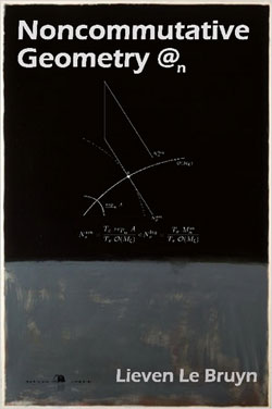
No legal hassle, no VAT-numbers, nothing required (or so it seemed). Still, before risking his sister’s thesis he wanted to check the service out and as it is a lot easier to take a book lying around rather than write one yourself he took my version 2 and published it at Lulu’s (since then this version is nicknamed Rothko@n).
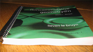
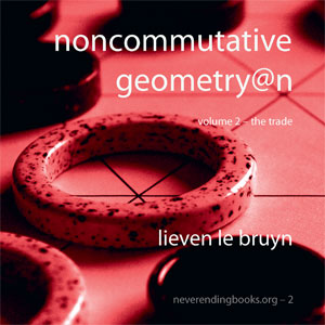
Although I gave him the permission to do so, it didn’t feel right that people should pay even a small amount for a nicely bound unedited version 2. So, the last month and a half I’ve been editing and partially rewriting version 2 and the two volumes are now available!
Major changes are to the 4 middle chapters. There is now chapter 3 “Etale Technology” which contains all of the etale tricks scattered earlier in two chapters, chapter 4 ‚”Quiver Representations” collects all the
quiver material (again, scattered throughout the previous version). Chapter 5 ‚”Semisimple Representations” now includes recent material such as Raf’s characterization of the smooth locus of Cayley-smooth orders and our (together with Geert) classification of the central singularities, and chapter 6 ‚”Nilpotent Representations” now includes the material on Brauer-Severi varities which was in version 1 but somehow didn’t make it to version 2 before.

