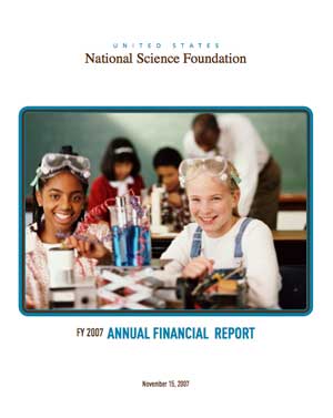
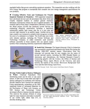
Annual reports of organizations often make extremely dry reading. With available word processing tools, however, several agencies try to make their report at least visually pleasing. A good example is the 2007 annual report of the NSF (USA). It has an attractive cover (left) and has a couple of daring inside pages, such as the one on the right.
I’ve been a researcher with the Flemish National Science Foundation FWO from 1980 till 2000, when I’ve opted for a professorship rather than keeping my permanent research position with them. At the time, it seemed like a sensible move to make, but I’m beginning to have my doubts… The FWO definitely rocks! Single handedly they’ve taken the art of science-organization-reporting to galactic levels with their 2007 year book. Here is the cover
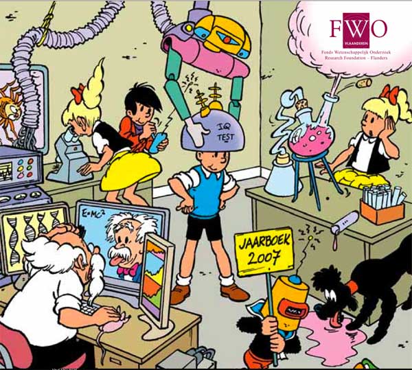
based on the comic book series Jommeke. So what? They have an (arguably) even more attractive cover-picture…
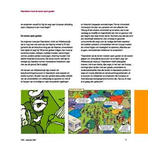
The point is that they maintain this gimmick throughout the entire report! If you don’t believe me, download the entire book from the link above. But as it is over 1Mb, I’ll provide you with two generic illustrations : on the left a typical (as in “every”) page and even pie-charts are way too dry for the FWO-admins so they solved it (right)
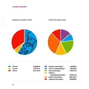
Probably the message they want to broadcast is : you guys can easily beat us at science, but we still have the best comic-books!!!
I bet, next year they’ll base their report on the series Spike and Suzy (Suske&Wiske for the rest of us) and the year after they’ll probably go for Tintin (that is, if Flandres can forget by then that Herge was a French speaking Belgian). I’m confident that in 2009 the FWO will spend most of its energy debating this issue…
Leave a Comment