Skip to content →

Category: art

Designer Maths

This fall, I’ll be teaching ‘Mathematics for Designers’ to first year students in Architecture.

The past few weeks I’ve been looking around for topics to be included in such as course, relevant to architects/artists (not necessarily to engineers/mathematicians).

One of the best texts I’ve found on this (perhaps in need of a slight update) is the 1986-paper by Jay Kappraff: A course in the mathematics of design. He suggests the following list of topics:

  • graph theory
  • polyhedra
  • tilings of the plane
  • three dimensional packings
  • proportion and the golden mean
  • transformations
  • symmetry
  • vectors

We all know that an awful lot of math and computation is needed to design a building, but today all of the hardcore use of vectors, equations and transformations is conveniently hidden from the architect’s view by digital design platforms and CAD-programs.

These computational tools offer new creative possibilities, as illustrated in the beautiful book The new mathematics of architecture by Jane Burry and Mark Burry, also available in Dutch with a cover picture of the Möbius bridge in Bristol
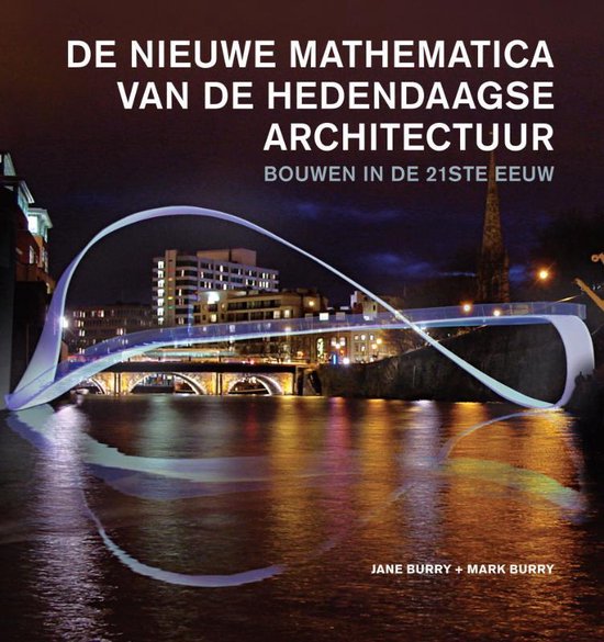


In this book, about 50 recent architectural projects are clustered around these topics:

  • mathematical surfaces and seriality
  • chaos, complexity, emergence
  • packings and tilings
  • optimization
  • topology
  • datascapes and multi-dimensionality

In the description of the projects, cool math-topics are (sadly only) touched, including

It will take me some time to find a balance between these two approaches. Common themes clearly are

  • Shapes : what is possible/impossible in 2D and 3D, and how can mathematics help us to find new exciting shapes (think minimal and Seifert surfaces, knot complements, etc.)
  • Symmetry : what is possible/impossible in 2D and 3D, and what can mathematics tell us about new symmetries (think emerging symmetries from aperiodic tilings and quasicrystals)

Over the coming months I’ll be writing the course notes and may post about it here. For this reason I’ve included a new category DesignerMaths.

If you have suggestions, please let me know.

2 Comments
Escher’s stairs

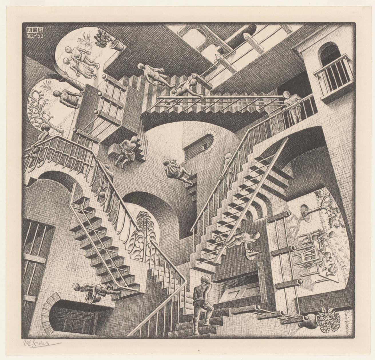
Stairways feature prominently in several drawings by Maurits Cornelis (“Mauk”) Escher, for example in this lithograph print Relativity from 1953.


Relativity (M. C. Escher) – Photo Credit

From its Wikipedia page:

In the world of ‘Relativity’, there are three sources of gravity, each being orthogonal to the two others.
Each inhabitant lives in one of the gravity wells, where normal physical laws apply.
There are sixteen characters, spread between each gravity source, six in one and five each in the other two.
The apparent confusion of the lithograph print comes from the fact that the three gravity sources are depicted in the same space.
The structure has seven stairways, and each stairway can be used by people who belong to two different gravity sources.

Escher’s inspiration for “Relativity” (h/t Gerard Westendorp on Twitter) were his recollections of the staircases in his old secondary school in Arnhem, the Lorentz HBS.
The name comes from the Dutch physicist and Nobel prize winner Hendrik Antoon Lorentz who attended from 1866 to 1869, the “Hogere Burger School” in Arnhem, then at a different location (Willemsplein).


Stairways Lorentz HBS in Arnhem – Photo Credit

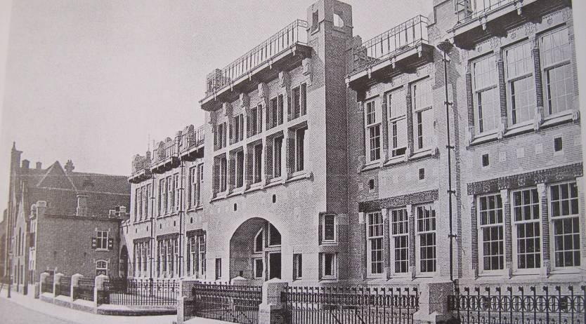
Between 1912 and 1918 Mauk Escher attended the Arnhem HBS, located in the Schoolstraat and build in 1904-05 by the architect Gerrit Versteeg. The school building is constructed around a monumental central stairway.


Arnhem HBS – G. Versteeg 1904-05 – Photo Credit


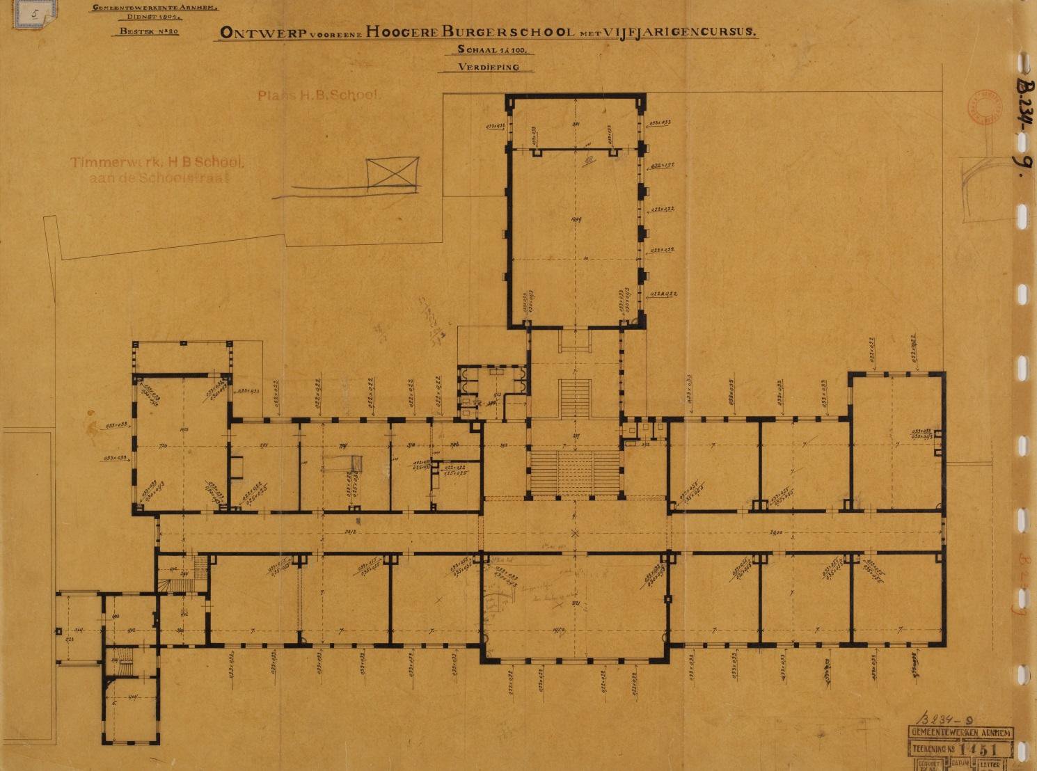
Plan HBS-Arnhem by G. Versteeg – Photo Credit

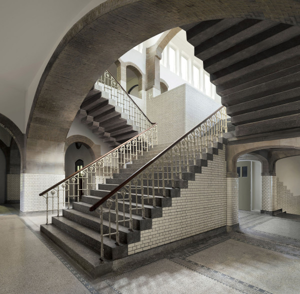
If you flip the picture below in the vertical direction, the two side-stairways become accessible to figures living in an opposite gravitation field.


Central staircase HBS Arnhem – Photo Credit

There’s an excellent post on the Arnhem-years of Mauk Escher by Pieter van der Kuil. Unfortunately (for most of you) in Dutch, but perhaps Google translate can do its magic here.

Leave a Comment

Lockdown reading : Bacon

In this series I’ll mention some books I found entertaining, stimulating or comforting during these Corona times. Read them at your own risk.


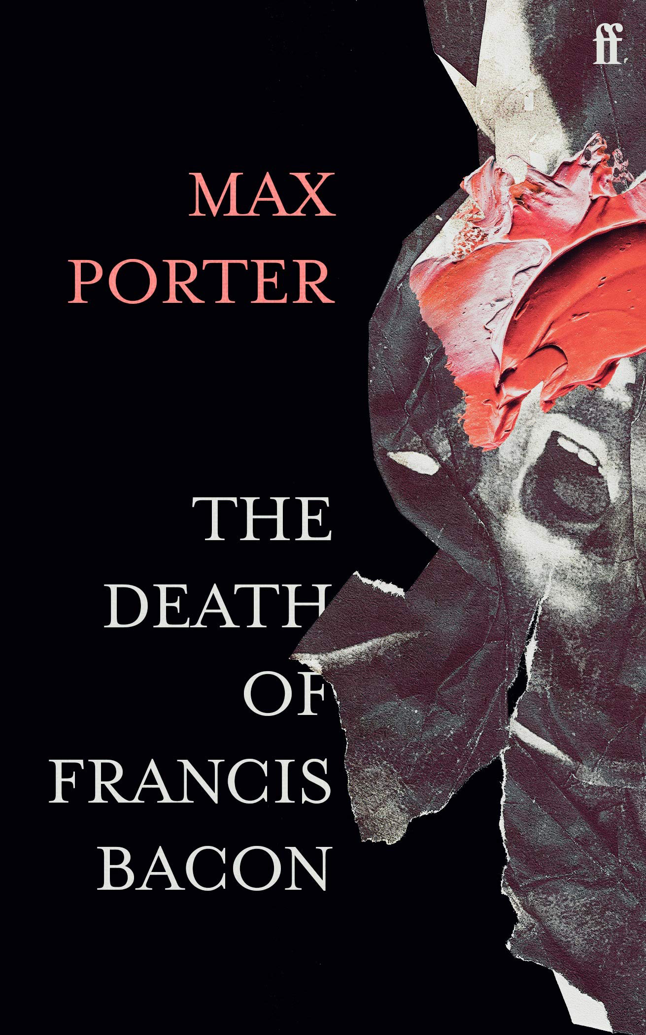
In an attempt to raise the level of this series, I tried to get through the latest hype in high-brow literature: The Death of Francis Bacon by Max Porter.

It’s an extremely thin book, just 43 pages long, hardly a novella. My Kindle said I should be able to read it in less than an hour.

Boy, did that turn out differently. I’m a week into this book, and still struggling.


Chapter 4(?) :Three Studies for a Self-Portrait, (Francis Bacon, 1979)

A few minutes into the book I realised I didn’t know the first thing about Bacon’s death, and that the book was not going to offer me that setting. Fortunately, there’s always Wikipedia:

While holidaying in Madrid in 1992, Bacon was admitted to the Handmaids of Maria, a private clinic, where he was cared for by Sister Mercedes. His chronic asthma, which had plagued him all his life, had developed into a more severe respiratory condition and he could not talk or breathe very well.

Fine, at least I now knew where “Darling mama, sister oh Dios, Mercedes” (p.7) came from, and why every chapter ended with “Intenta descansar” (try to rest).

While I’m somewhat familiar with Bacon’s paintings, I did know too little about his life to follow the clues sprinkled throughout the book. Fortunately, there’s this excellent documentary about his life: “Francis Bacon: A Brush with Violence” (2017)

Okay, now I could place many of the characters visiting Bacon, either physically sitting on the chair he offers at the start of each chapter (“Take a seat why don’t you”), or merely as memories playing around in his head. It’s a bit unclear to me.

Then, there’s the structure of the book. Each of the seven chapters has as title the dimensions of a painting:

  • One: Oil on canvas, 60 x 46 1/2 in.
  • Two: Oil on canvas, 65 1/2 x 56 in.
  • Three: Oil on canvas, 65 x 56 in.
  • Four: Oil on canvas, 14 x 12 in.
  • Five: Oil on canvas, 78 x 58 in.
  • Six: Oil on canvas, 37 x 29 in.
  • Seven: Oil on canvas, 77 x 52 in.

Being the person I am, I hoped that if I could track down the corresponding Bacon paintings, I might begin to understand the corresponding chapter. Fortunately, Wikipedia provides a List of paintings by Francis Bacon.

Many of Bacon’s paintings are triptychs, and the dimensions refer to those of a single panel. So, even if I found the correct triptych I still had to figure out which of the three panels corresponds to the chapter.

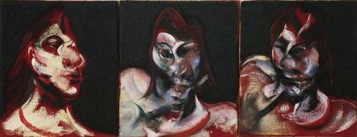
And often, there are several possible candidates. The 14 x 12 in. panel-format Bacon often used for studies for larger works. So, chapter 4 might as well refer to his studies for a self portrait (see above), or to the three studies for a portrait of Henrietta Moraes:


Chapter 4(?) : Three studies for portrait of Henrietta Moraes (1963)

Here are some of my best guesses:


Chapter 3(?): Portrait of Henrietta Moraes (1963)


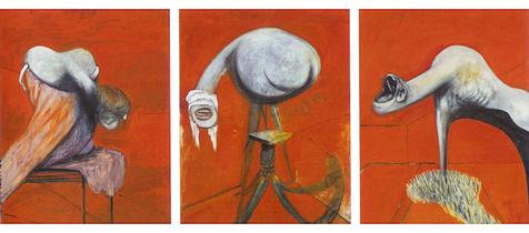
Chapter 6(?): Three Studies for Figures at the Base of a Crucifixion (1944)


Chapter 5(?): Triptych Inspired by the Oresteia of Aeschylus (1981)

No doubt, I’m just on a wild goose chase here. Probably, Max Porter is merely using existing dimensions of Bacon paintings for blank canvases to smear his words on, as explained in this erudite ArtReview What Does It Mean To Write a Painting?.

Here’s the writer Max Porter himself, explaining his book.

Leave a Comment